business information

Affiliates and Collaborations

DriveThruRPG.com

As the year marches on and the studios slowly gets closer to releasing its first official game title, looking at marketing and distribution is a critical component to the release of our product. To that end, we have created an affiliate status with DriveThruRPG.com and plan on having them become the sole digital distributor of our product (physical copies will be distributed directly by the studios or through select retail outlets). Clicking on the image to the right will take you to their site for those interested in checking out everything they offer.

Additionally, we will be collaborating with a model for some of our artwork that will be appearing in featured studio projects. We are very excited about this venture, and while it is not exclusive, will still provide us with some quality images for our use! Check out even more information, and a sneak peak of the first finalized image in coming weeks, at my Patreon site here.

This week will also see the ad campaign for the studios kick off on Facebook. Advertising for the game release will happen closer to that time (around the end of this year) but the more traditional business advertising will be ongoing throughout the summer that will include local, national, and international efforts.

Summer Advertising Blitz

Streaming Circles

Work at the studios has been moving along nicely. The majority of the work is focused on the upcoming game release, along with maintaining the various social media sites, Patreon, the Zazzle store site, and others. Advertising is a key element to the success of any business, and overall the studios have had a relatively small advertisement footprint. Part of this is by design, and part of it is by circumstance.

The "by design" part is because a large effort in advertising is going to erupt once the first game design is ready for launch. This is expected to build up hype beyond what information is already out there and really focus on bringing in interested people to take a look at the game system and make the decision to buy or not. The "by circumstance" element is simply because of all of the different methods of getting the name out to the public, and the myriad of forms that advertising can take often leads, as in this case, to trying out one or two options and see where that gets us. For instance, the Zazzle storefront has picked up a trickling of orders all on its own based on the variety of products for sale and people stumbling upon things that interest them. Page hits on Deviant Art are letting people know about the digital art aspect of the business. Facebook keeps those who are following the business there in the loop, even if they do not regularly come to the main website here. Each of these efforts are paying off, even in small quantities, and have cost next to nothing but the time invested in getting the campaigns off the ground. This works only in so far as keeping operating costs low.

Launching an advertisement campaign is both exciting and nerve wracking. The first major effort will be targeting local businesses to know about the design and branding elements that the studio offers. The first mass mailing will look like the image posted above. Additionally, this type of advertising can go into other areas to gain more attention outside of the surrounding area where the studios exists physically. Measuring success is important when committing financial resources to advertise. Getting a good return on investment (ROI) means that a campaign was successful and may prove beneficial to do again in the future. 

Getting Extras

As we move into the second half of the year and progress continues towards getting the studios' first game release... well, released, there was talk about whether or not anything was needed to make the game a reality. The end answer is no, there is ample funding to see the game through its development stages and into production. Having satisfied that question, another thought emerged. Would anyone want more? I know from past experience I have enjoyed getting the opportunity to pick up exclusive content, or promotional items, from a game or genre that really interested me. Having said that, I considered some options on how something like this could occur. The result was Patreon.

Patreon is a way for artists, designers, and others to put out things they love while obtaining financial backing to put out those things. While the studios does not need financial help to release the game, anything extra is not in the budget, even if sales were to come from additional items. However, without knowing what demand, if any, there is for the variety of promotional and bonus offerings that could come from this endeavor, it makes little business sense to have a bunch of products made and have them sit on a shelf. Patreon allows me to determine what interest there is for these sorts of extra goodies, or swag as some refer to it, and allow it to fund itself. This way, for friends or fans, who would like extras from the game they can support it to the level they choose rather than becoming locked into a purchase price for something that is too costly and delivers none of what they want.

Check out the Patreon site here to see all of the extras that are planned along with the launch of the game.

New Banner... sorry Bruce (heh)

The main banner to the website and a number of social media platforms has always been something that was under constant review and critique. While the concept was spot on with the message, the delivery was off. The result is a new banner that conveys the same ideas behind the streaming of consciousness, but delivered in another artistic manner. Will this be the final redesign? Doubtful. The original banner still exists as well, for it would be inappropriate to forget one's history. Nonetheless, it was time for the upgrade, and continual refinement will likely always be a constant companion in regard to the studio's image and branding. Hopefully everyone is pleased with the new look, but if not, feel free to comment. These artistic designs are as much to please the viewers as to the creator, and sometimes is it difficult to be one's own worst critic.

Streaming consciousness indeed...

Streaming consciousness indeed...

Continually learning

The studios are gearing up for their first major advertising campaign this summer. During this time, deciding on the best way to showcase what we do is a critical decision that can mean the difference between attracting more clients and simply having the effort flop. So, in an effort to capture the best ideas and display them, pursuing newer methods of expression does, and ultimately must, happen..

My experience with art has been over a long stretch of time, but hardly without interruption. Art classes, drafting, creative writing, and yearbook layout during high school. Some design and communication courses in college. Endeavors in magazine writing and editing. Working with a variety of digital and design software. This long list of accolades certainly looks impressive, but the key thing is that I am still learning. That happens regularly as the studios continue working on a variety of efforts, both with photo editing as well as creative designs from scratch. It is an enjoyable exercise, even if frustration settles in and a piece is scrapped. Learning what cannot be done is as valuable as learning what is accomplishable.

Life is a journey.. make the most of it.

Take a break, join a professional organization!

I have found that taking a break, even from the joys of creating digital artwork, is invaluable. I still have yet to wrangle enough time out of every day to spend what I truly want to on designing and the various projects the studio has at the moment. However, stepping back to catch your breath is healthy and brings other rewards as well. Looking at a work in progress after a bit of a hiatus sometimes results in real benefits and allows for a more honest critiquing of the design (see the previous post entitled "2nd Time's a Charm... at least for now" for another story about this topic). The trick is to not be away for too long though, so that any rhythm in the design work is not lost. So how does one spend all the extra time gained from this venture? By joining a professional organization, of course!

After following some advice from a few classes I have taken recently, I looked into the American Institute of Graphic Arts (AIGA) and obtained a membership. You can see my profile here. The biggest benefit is the potential contacts within the industry, including from a nearby, albeit a bit of a drive, local chapter. The perks do not stop there, and what I have read so far convinced me that becoming an official part of the graphic art community was worth the investment. Now, while joining a professional organization is not likely to occur every time a break away from designing is warranted, it worked out rather well this time.

Custom Work and Website Additions

Mad Murphy

The studios just finished up a custom piece of pro bono artwork for a good friend. He was gracious enough to allow the work to be done without any idea of the final product and permitted us to showcase the work here and on Facebook. That image is displayed to the right. The costume work was all his and inspired the overall wasteland theme.

The studios finally has its products and services page up and running. For those interested in purchasing custom art or needing some photo editing done, you now can order directly. We will be running a sale for all photo editing and design work for a good while as a way to celebrate the business launch. Please keep in mind though that all files are digital. We can offer some options to physically print the final artwork, but there are additional charges and the need to obtain information like a mailing address that we would otherwise not require. Please also keep in mind that we need to know what you want done specifically, and that necessitates some communication between us and you. Make sure you provide the studios with a way to contact you. Some services might cost more than listed, but in many cases that is avoidable if we know what you want up front.

Muninn Designs goes live

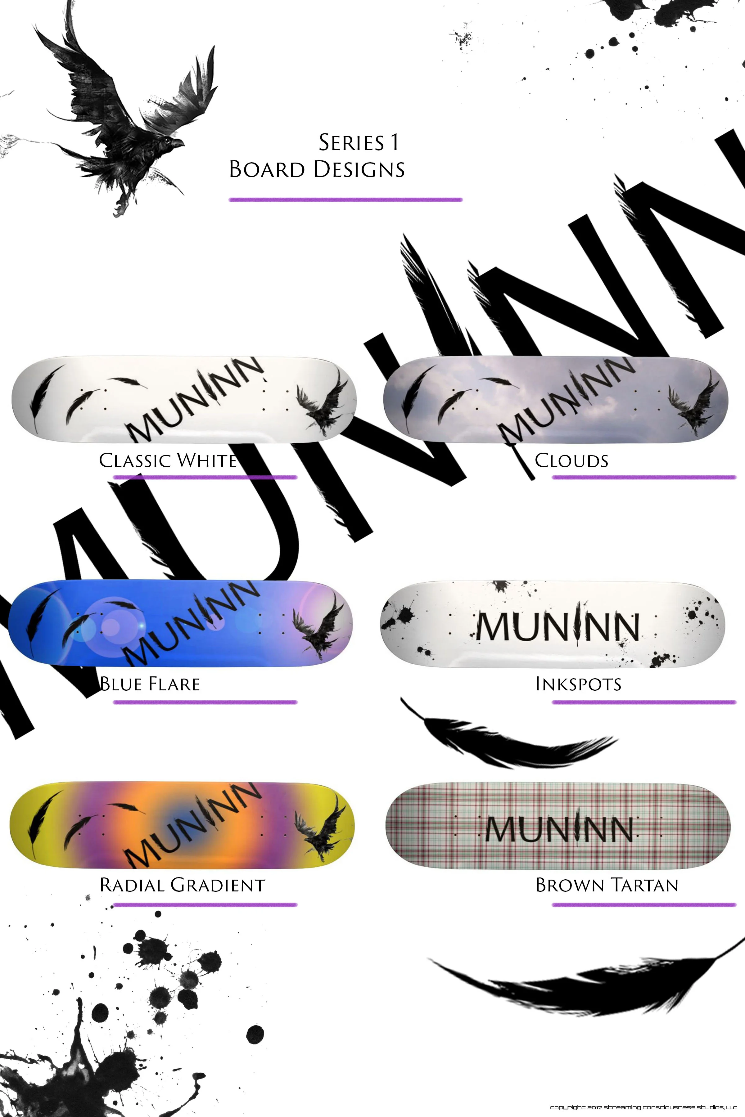
series 1 board design poster

Muninn Designs is a creative brand of the studios and has released Series 1 of its skateboard designs. The poster displayed to the right is the social media and art website advertisement that showcases elements from the designs and the boards themselves. Muninn Designs also has its own page here to allow everyone to see the boards individually and order them through Zazzle if interested.

Over the coming months, Muninn Designs plans to release a second series of board designs showcased around the raven theme while introducing new creative elements. Also in the works for later in the year is a subset of skateboard designs revolving around a second, unique brand direction. This branding will be revealed here and across social media closer to the release of those designs.

2nd Time's a Charm... at least for now

A fairly productive afternoon spent mostly on the game design aspect of the workload resulted in a redesign of the front and back covers. Stepping away from a project for a while (as mentioned in the previous post) is often therapeutic, but it also allows for the initial "cool factor" of a completed design to wear off a bit. If a design holds up upon return and close scrutiny, then mission accomplished. Otherwise, if something isn't quite right, whether it is a single element or the entire design, then returning to the (digital) drawing board is the only way to correct the issue.

The latter was what occurred, and today was the day to take care of the "problems." Quotes are used there, because the design idea was solid, but certain portions just weren't quite where they needed to be artistically. The back cover was easy, because the original design was simply too bland, but adding a subtle digital art element fixed that right up! The front cover, actually the variant cover, needed cleaner art and required more of a time commitment. A few other interior design elements and pages were also created, and the whole project is once again moving along at a nice pace.

Oh, the places you will go...

Phoenix Flower

Sometimes the creative process takes us in different directions than we originally intend. While this is often not a bad thing, it does make one wonder who is really in charge - the artist, or the process? This began recently while working on the design displayed here. The concept itself was very straightforward, find a theme for this amazing flower found growing randomly in the yard a few weeks ago. All sorts of ideas came to the forefront, including the flower growing in a variety of desolate locations. Then the thoughts turned to the transformation pieces done earlier this year, most notably Muninn. The final result is the Phoenix Flower that has been making its way around the studios' social media feeds and Deviant Art. If this all stopped here, then it would be an interesting story if nothing more. The true revelation is during the review of this art piece, a whole new idea sparked, again based off of the earlier transformation pieces and the Muninn project.

The new direction the studios is currently undertaking is a series of skateboard designs based around Muninn and some banner designs that have cropped up after completing Phoenix Flower. In the coming weeks, the studios will be showcasing the entire range of skateboard designs created from this spark of inspiration. The total number will be quite hefty and may warrant a separate page on their own.

Stay tuned...